I am posting some visual identity expamples from Behance Network. This would be good for our students taking VA 301 course.
And please check the branding section of Behance and this site as a whole: Branding Served
I am posting some visual identity expamples from Behance Network. This would be good for our students taking VA 301 course.
And please check the branding section of Behance and this site as a whole: Branding Served
This is a nice tool for interactive drawing. Using Jay’s application you can draw really complex (and cool!) looking images. It’s basically a line drawing tool where you just put dots on the canvas and they create lines – But the trick is, the new point you put gets connected with the nearest dots you already drew. The result is a geometric line explosion and it really looks incredible if you use it the right way (just look at the images). There is a <a title=”web app for sketchy structures” href=”http://jayweeks.com/sketchy-structures-html5-canvas/#/ web application that you can instantly play with and also an Adobe Illustrator Scriptographer script (for the latter, take a look at scriptographer page on how to install and use it- it’s an amazingly good tool for illustrator fans!, you’ll thank me..)
Can anyone tell me why we never see these kind of posters on street of istanbul? let alone istanbul, at least on facebook event pages or something?.. Ok i’ll calm down.. Just check them out and see how they engage you to go to your fav band’s gig..
hi hi hi, back in the game..
Funny that i’ve never heard of such a web site (maybe you did?) … The host (Adrian Shaughnessy) organized a nice compilation of radio interviews with some of the big names from the area (like Stefan Sagmeister, Neville Brody, and many more). Shows are inspiring to listen and there’s nice music in-between conversations too. I would love to listen a version with Turkish designers… Hopefully someone will do it one day.. Here is the link..
Highly recommended inspirational web site, Thinking for a Living has many useful articles and posts. It’s worth taking a look at this site.
Short video conversations with important architects, designers, authors and leaders of iconic brands.
We asked them two questions: “What single example of design inspires you most?” and “What problem should design solve next?” Their answers might surprise you. But hopefully, they’ll all inspire you.
these days i’m focused on my thesis and reading lots of stuff on information design. wurman is an important reference too and i wanted to share it obviously. it’s an old interview but i still find it very nourishing. wurman’s thoughts about clarity of information, its dissemination, how to find and conceive information are just inspiring.

What is critical is to understand what it is like not to understand. My definition of learning is to remember what you are interested in. If you don’t remember something, you haven’t learned it, and you are never going to remember something unless you are interested in it. These words dance together. ‘Interest’ is another holy word and drives ‘memory’. Combine them and you have learning. If that is so, and I believe it is, then our entire system of education is bankrupt because what is taught to you is not what you are interested in, and it is not taught to you in a method that can accentuate the interest so you build up a whole fibrous web of learning for yourself. Not an interest you have that doesn’t connect with everything else in the world. So why not go in through your interests? But that is not how our school systems are set up. You memorize things you are not interested in, throw them up on a test, and then you forget them.
i think those who are interested in information design (information architecture in wurman’s terminology) should know and read about wurman and it also should be a necessary reading along with famously referenced tufte (respect).
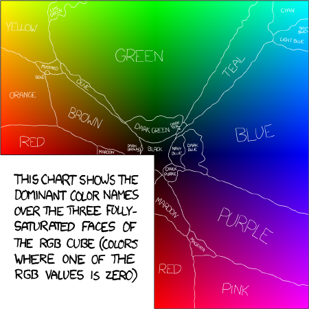
a nice survey on how color names are known among girls and boys. i feel weird about this…


i encountered this entertaining infographic. i think it is certainly meaningful and there are good points in it (i actually laughed at the part with ff din). of course these are good observations but don’t have it as a reference and use only these fonts.
click on the image to visit julian hansen’s page.
Great film for Google’s internet browser Chrome. Created by BBH New York, BBH London & the team at Glue London worked super closely together with the Google team on the development of the strategy, creative and media. The Director was Aaron Duffy and the production company were 1st Avenue Machine in New York. Behind the scene is here.
amazing.
babylon logo was never a special one but this..
on/off logo will never be the same for me… neither will babylon:)

when i was just chatting with a friend about how i admire handcrafted – non computational works much more than computational/interactive works, i came across this friendly, kind of crazed project.

cameron moll reconstructed colosseum by type (Goudy Trajan and Bembo Pro to be specific), letter by letter with some additional glyphs based on italian calligrapher M. Giovambattista Palatino, as featured in Libro di M. Giovambattista Palatino Cittadino Romano, published in Rome around 1550 AD.
i can feel the hard work just by focusing on a little portion of the typed building. just wow…


Despite a sparkling career he withdrew from the world of haute couture in 1980 to follow his own path, which seems to have included creating a foundation for the promotion of apparel-art as well as staging annual fashion-art shows in various locations around the world, in “any city that will welcome me” as he apparently says…
…
Read more about Roberto Capucci here.