Skip navigation

Category Archives: Illustration

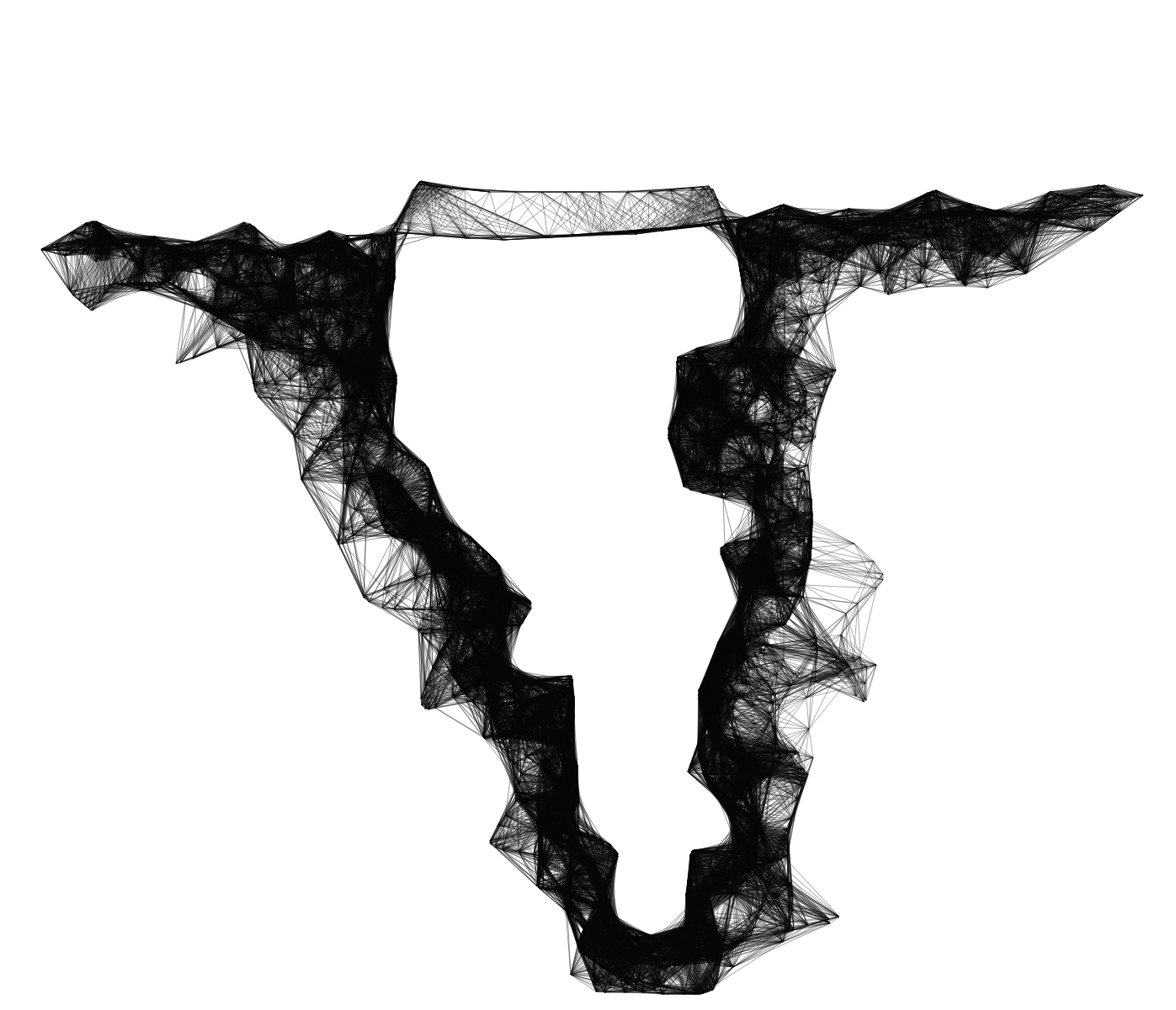
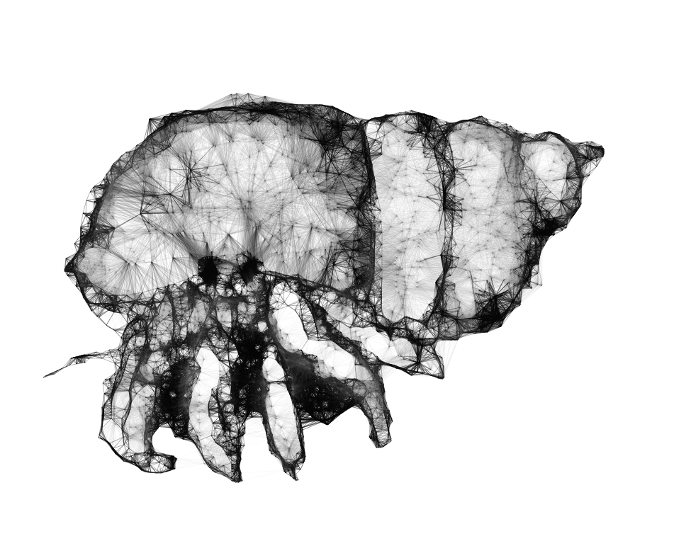
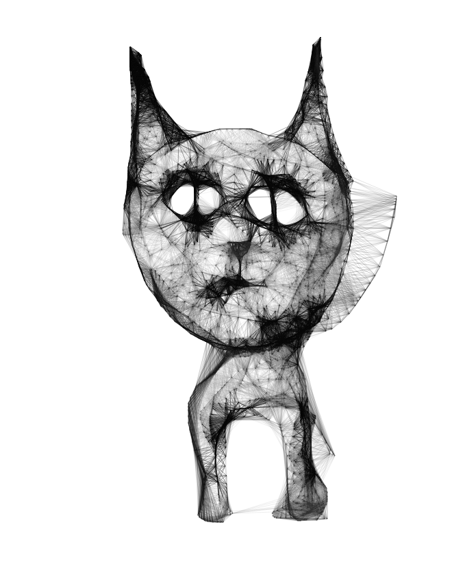
This is a nice tool for interactive drawing. Using Jay’s application you can draw really complex (and cool!) looking images. It’s basically a line drawing tool where you just put dots on the canvas and they create lines – But the trick is, the new point you put gets connected with the nearest dots you already drew. The result is a geometric line explosion and it really looks incredible if you use it the right way (just look at the images). There is a <a title=”web app for sketchy structures” href=”http://jayweeks.com/sketchy-structures-html5-canvas/#/ web application that you can instantly play with and also an Adobe Illustrator Scriptographer script  (for the latter, take a look at scriptographer page on how to install and use it- it’s an amazingly good tool for illustrator fans!, you’ll thank me..)

Can anyone tell me why we never see these kind of posters on street of istanbul? let alone istanbul, at least on facebook event pages or something?.. Ok i’ll calm down.. Just check them out and see how they engage you to go to your fav band’s gig..

Magnificent! Created by Alex Beltechi, seen on behance.

WOW!! This is a great page with a huge collection of old and new posters. Incredible examples and designers. Perfect place to check out for history lesson, influence and creativity (and of course jealousy..) I’m having difficulty to choose for samples.. Please visit the page yourself and immerse..

Tigre Milena, aka. Doni Parlanti is a high powered professional in a field completely unrelated to Victorian fairy tales.

In her “other” life Tigre is an avatar in the virtual world of Second Life®, where she shows some extraordinary skills and talents which have nothing whatsoever to do with the demands of her “Real Life” job: Tigre sets up complex scenes (which are actually lived-in locations within her own virtual home), populated with the costumed avatars of her close friends as well as her own “alt” avatars. She then takes virtual photographs of these scenes and proceeds to re-create them as 19th century inspired illustrations, which she does in fact “dedicate to all the great Victorian illustrators of children’s books”. The outcome is simply stunning, as the images below will show. Small wonder, since before all else Tigre holds a degree in arts and crafts. Since Tigre does not have a dedicated domain for these beauties I am going to link all of the series to here:

“Bedtime Tales”

“Where’s the cheese?”

“Charades” (inspired by  the book Vanity Fair (1848) by William Makepeace Thackeray)

“A scrub in the tub”

The Liberty of Jazz

Image catcher’s Room Studio

Urgence and Cat sleeping on knees

http://www.flickr.com/photos/post-it01/

I changed the wordpress theme on my personal blog just now and so I made a bunch of new images for the header using the visual manipulation distortion filters. Although these have been around forever they are probably still amongst some of the best image deconstruction tools that I know of. Not to mention that they are also open sourced…

Although they still work beautifully even with PS CS5 the VM plugins are kind of hard to come by these days. I have therefore decided to share mine, available from here. These are PC only, as far as I know there never were any made for Mac. Simply unzip and put in the plugins directory of photoshop.

Unfortunately, I cannot add an image to this post since the artist has disabled all downloads and links. And who can blame him, given the nature of what he is showing! This is a truly extraordinary-must-see series. Highly recommended!

See the full set here.

Christopher Berry on The Guide to Gentlemanly Pursuits:

http://bldgwlf.com/christopher-berry/

“In an attempt to honor the sections of old growth forest I’ve likely destroyed, The Guide to Gentlemanly Pursuits is an experiment I’ve undertaken for the summer. The rules are simple:

1) Collect all napkins and meeting notes.
2) Draw a moustache on every doodle.
3) Present the best of the week.”

See his full portfolio – an utter delight! – here:
http://ivoryhighrise.com/

Follow his blog here:
http://ilikeyougraphik.blogspot.com/


Developed for Wired Italy by Density Design.

Creative direction: Donato Ricci
Concept: Michele Graffieti, Luca Masud, Mario Porpora, Gaia Scagnetti
Illustration: Michele Graffieti

Click image above for huge version!

there will be 2 sets of workshops at sabanci university in july on how to visualize scientific data and information.

How can we make sense of the information that surrounds us in today’s complex world? How can we make explanations of the natural and the man-made world; give visual expression to otherwise invisible information; help ease complex tasks; or help people find their way. How can we bring order to rich databases as well as the built environment using elements of visual communication?

Designers achieve these tasks by exploring the nature of information. They interpret and communicate information using the same elements they use in creating aesthetic pleasure, that is, lines, shapes, and colors — but with their added knowledge of the processes that help human cognition.

please check the workshop website for further information. any scientist who has an idea to visualize in any subject (computer science, mechanics, biology, chemistry, physics, etc..) or any designer who likes to work on information design, information visualization and infographics are welcome. this will be a collaborated event so there will be lots of group work and hopefully lots of nice outcomes.

when i was just chatting with a friend about how i admire handcrafted – non computational works much more than computational/interactive works, i came across this friendly, kind of crazed project.

cameron moll reconstructed colosseum by type (Goudy Trajan and Bembo Pro to be specific), letter by letter with some additional glyphs based on italian calligrapher M. Giovambattista Palatino, as featured in Libro di M. Giovambattista Palatino Cittadino Romano, published in Rome around 1550 AD.

i can feel the hard work just by focusing on a little portion of the typed building. just wow…

No other living creature features as heavily in contemporary character design and art as the humble hare. But what exactly makes bunnies so irresistible to artists, designers and illustrators worldwide? Depending on the viewers’ cultural context rabbits can symbolize anything from insanity, alertness, defenselessness, all the way to promiscuity, magic powers and utter innocence. By condensing the endless variations of the rabbit motif into one ultimate system – a perfect bunny mandala – the true nature of the beast emerges: the eternal essence of rabbit.

Pictoplasma (http://www.pictoplasma.com) asked internationally established and upcoming character designers, illustrators and artists around the globe to send in their versions of rabbits, bunnies, hares and everything in between. The result is a full-scale bunny overdose, with far more than 1.500 individual rabbits from 500+ international contributors. [Visual Complexity]

Paul Hollingworth’s remarkable typographic assemblages. View more here.

Brilliant custom made hand-lettering! This is Jim Tierney’s Jules Verne book cover, spine and jacket design. I’m mostly impressed with the use of color and of course his original script for the cover. His video documentation is totally a different story. The background sound matches perfect with the design. What else? Ha! lastly, the compass kind of feature that is placed in the center pocket of the book which works perfect as an introduction for such books written by Jules Verne.

You can watch the short video documentary of the project here.

http://faceoutbooks.com/#267967/Jules-Verne-Series

Onur-